
Top 5 coded menu for blogger HTML css
 Dhanjee Rider
Top 5 Custom coded mobile menu HTML css
Here I have provided top 5 beautiful custom coded mobile menu and header Menu for blogger websiteMobile menus have become an essential feature for any website, as more and more people access websites from their mobile devices. A well-designed mobile menu can help users navigate your website easily and find the information they are looking for quickly. In this post, we will discuss how to create a custom-coded mobile menu that overlays in the bottom side, and we will provide you with four different styles of mobile menus that you can use on your blogger website.

The first step in creating a custom-coded mobile menu is to create the HTML structure for the menu. You can start by creating a <nav> element that will contain all the menu items. Inside the <nav> element, you can create a list of menu items using the <ul> and <li> elements.
Once you have created the HTML structure for the menu, you can start styling it with CSS. You can use CSS to add colors, fonts, and other visual elements to the menu. You can also use CSS to make the menu responsive, so it looks good on all screen sizes.
The final step in creating a custom-coded mobile menu is to add JavaScript for functionality. You can use JavaScript to add animations and other interactive elements to the menu. You can also use JavaScript to toggle the menu on and off when the user clicks on the menu button.
Now that you know how to create a custom-coded mobile menu, let's take a look at four different styles of mobile menus that you can use on your blogger website.Hamburger menu

Creating a custom-coded mobile menu
Creating a custom-coded mobile menu for your website can be a bit challenging, especially if you are not familiar with web development. However, with the right tools and some basic knowledge of HTML, CSS, and JavaScript, you can create a beautiful and functional mobile menu that will enhance the user experience of your website.Step 1: Create the HTML structure
The first step in creating a custom-coded mobile menu is to create the HTML structure for the menu. You can start by creating a <nav> element that will contain all the menu items. Inside the <nav> element, you can create a list of menu items using the <ul> and <li> elements.
Step 2: Style the menu with CSS
Once you have created the HTML structure for the menu, you can start styling it with CSS. You can use CSS to add colors, fonts, and other visual elements to the menu. You can also use CSS to make the menu responsive, so it looks good on all screen sizes.
Step 3: Add JavaScript for functionality
The final step in creating a custom-coded mobile menu is to add JavaScript for functionality. You can use JavaScript to add animations and other interactive elements to the menu. You can also use JavaScript to toggle the menu on and off when the user clicks on the menu button.
Four styles of mobile menu for blogger website
Now that you know how to create a custom-coded mobile menu, let's take a look at four different styles of mobile menus that you can use on your blogger website.Hamburger menu
hamburger menu
The hamburger menu is a popular style of mobile menu that is characterized by three horizontal lines stacked on top of each other. When the user clicks on the hamburger menu, the menu items slide out from the side of the screen. This style of menu is simple and easy to use, and it is perfect for websites with a lot of menu items.Slide-in menuBut don't vary you need only copy and paste 😁

One code for making menu just copy paste and chenge your website link
Animated mobile menu V1

    <nav class='mobile' id='ATnav'>

  <ul>
  <li> <a href='#'><svg style="color: blue" xmlns="http://www.w3.org/2000/svg" width="16" height="16" fill="currentColor" class="bi bi-house-door-fill" viewbox="0 0 16 16"> <path d="M6.5 14.5v-3.505c0-.245.25-.495.5-.495h2c.25 0 .5.25.5.5v3.5a.5.5 0 0 0 .5.5h4a.5.5 0 0 0 .5-.5v-7a.5.5 0 0 0-.146-.354L13 5.793V2.5a.5.5 0 0 0-.5-.5h-1a.5.5 0 0 0-.5.5v1.293L8.354 1.146a.5.5 0 0 0-.708 0l-6 6A.5.5 0 0 0 1.5 7.5v7a.5.5 0 0 0 .5.5h4a.5.5 0 0 0 .5-.5z" fill="blue"></path> </svg> <span>Home</span></a></li>

  <li><a href='#'><svg style="color: red" xmlns="http://www.w3.org/2000/svg" viewbox="0 0 256 256"><rect width="256" height="256" fill="none"></rect><path d="M219.9,140a92,92,0,0,1-184,0c0-23.1,9.9-49.7,29.4-79.1a8,8,0,0,1,5-3.4,8.2,8.2,0,0,1,6.1,1.2l32.2,21.5,30.9-64.8a7.9,7.9,0,0,1,5.8-4.4,8.1,8.1,0,0,1,7.1,2.2c14.7,14.7,31.5,32.6,44.6,53.4C212.4,91.1,219.9,115.1,219.9,140Z" fill="red"></path></svg><span>Trending</span></a> </li>

    <li><a href='https://youtube.com/dhanjeerider'><svg style="color: red" xmlns="http://www.w3.org/2000/svg" width="16" height="16" fill="currentColor" class="bi bi-youtube" viewbox="0 0 16 16"> <path d="M8.051 1.999h.089c.822.003 4.987.033 6.11.335a2.01 2.01 0 0 1 1.415 1.42c.101.38.172.883.22 1.402l.01.104.022.26.008.104c.065.914.073 1.77.074 1.957v.075c-.001.194-.01 1.108-.082 2.06l-.008.105-.009.104c-.05.572-.124 1.14-.235 1.558a2.007 2.007 0 0 1-1.415 1.42c-1.16.312-5.569.334-6.18.335h-.142c-.309 0-1.587-.006-2.927-.052l-.17-.006-.087-.004-.171-.007-.171-.007c-1.11-.049-2.167-.128-2.654-.26a2.007 2.007 0 0 1-1.415-1.419c-.111-.417-.185-.986-.235-1.558L.09 9.82l-.008-.104A31.4 31.4 0 0 1 0 7.68v-.123c.002-.215.01-.958.064-1.778l.007-.103.003-.052.008-.104.022-.26.01-.104c.048-.519.119-1.023.22-1.402a2.007 2.007 0 0 1 1.415-1.42c.487-.13 1.544-.21 2.654-.26l.17-.007.172-.006.086-.003.171-.007A99.788 99.788 0 0 1 7.858 2h.193zM6.4 5.209v4.818l4.157-2.408L6.4 5.209z" fill="red"></path> </svg> <span>YouTube</span></a></li>


    <li><a href='https://t.me/photo_editing_groups'><svg style="color: blue" xmlns="http://www.w3.org/2000/svg" width="16" height="16" fill="currentColor" class="bi bi-telegram" viewbox="0 0 16 16"> <path d="M16 8A8 8 0 1 1 0 8a8 8 0 0 1 16 0zM8.287 5.906c-.778.324-2.334.994-4.666 2.01-.378.15-.577.298-.595.442-.03.243.275.339.69.47l.175.055c.408.133.958.288 1.243.294.26.006.549-.1.868-.32 2.179-1.471 3.304-2.214 3.374-2.23.05-.012.12-.026.166.016.047.041.042.12.037.141-.03.129-1.227 1.241-1.846 1.817-.193.18-.33.307-.358.336a8.154 8.154 0 0 1-.188.186c-.38.366-.664.64.015 1.088.327.216.589.393.85.571.284.194.568.387.936.629.093.06.183.125.27.187.331.236.63.448.997.414.214-.02.435-.22.547-.82.265-1.417.786-4.486.906-5.751a1.426 1.426 0 0 0-.013-.315.337.337 0 0 0-.114-.217.526.526 0 0 0-.31-.093c-.3.005-.763.166-2.984 1.09z" fill="blue"></path> </svg>
<span>Group</span></a></li>


    <li><a href='#'><svg style="color: red" xmlns="http://www.w3.org/2000/svg" width="16" height="16" fill="currentColor" class="bi bi-arrow-up-circle-fill" viewbox="0 0 16 16"> <path d="M16 8A8 8 0 1 0 0 8a8 8 0 0 0 16 0zm-7.5 3.5a.5.5 0 0 1-1 0V5.707L5.354 7.854a.5.5 0 1 1-.708-.708l3-3a.5.5 0 0 1 .708 0l3 3a.5.5 0 0 1-.708.708L8.5 5.707V11.5z" fill="red"></path> </svg><span>Go to Top</span></a></li>

    </ul>

</nav>


<style>

      a{text-decoration: none;}
  nav.mobile { display: flex; position:fixed; right:20px; bottom: 20px; width: 90%; padding-right:0px; padding-left:0px; background: #fff;
 border: 2px solid black; z-index: 9999; margin: 0;
  font-weight:bold;  border-radius: 40px;
}

  .mobile {
	position: relative;
	margin: 300px auto 0;
	width: 50px;
	height: 250x;
	border-radius: 40px;
	background: linear-gradient(0deg, #000, #272727);
}

.mobile:before, .mobile:after {
	content: '';
	position: absolute;
	left: -2px;
	top: -2px;
	border-radius: 40px;
	background: linear-gradient(45deg, #00ffff, #fff100, #00ff00,#f8ff00, #f8ff00, #00ffff,
		#ffbfff, #00ff00,#f8ff00, #00ffff);
	background-size: 400%;
	width: calc(100% + 4px);
	height: calc(100% + 4px);
	z-index: -1;

	animation: steam 17s linear infinite;
}

@keyframes steam {
	0% {
		background-position: 0 0;
	}
	50% {
		background-position: 400% 0;
	}
	100% {
		background-position: 0 0;
	}
}

.mobile:after {
	filter: blur(15px);
}
   nav.mobile ul { list-style: none; display: flex; justify-content: space-between; align-items: center; width: 100%; margin: 0; justify-self: center; vertical-align: middle; } nav.mobile ul li { display: flex; flex-direction: column; align-items: center; font-size: 0.7rem; flex-grow: 1; margin: 7px 0; } nav.mobile ul li a { color: #222; font-size: inherit; display: var(--prP3M8); flex-direction: var(--mZSq9k); }nav.mobile ul li a svg{width: 24px; height: 24px; display: block;margin: 0 auto;} </style>


<script>
//<![CDATA[
var prevScrollpos = window.pageYOffset;
window.onscroll = function() {
var currentScrollPos = window.pageYOffset;
  if (prevScrollpos > currentScrollPos) {
    document.getElementById("ATnav").style.bottom = "0";
  } else {
    document.getElementById("ATnav").style.bottom = "-80px";
  }
  prevScrollpos = currentScrollPos;
}
//]]>
</script>
Slide menu code V1
<style>
.scrollable-tabs-container { font-family: "Alata", sans-serif; background: transperant; max-width: 375px; margin: -9px -30px; border-radius: 4px; overflow: hidden; position: relative; }
.scrollable-tabs-container ul { display: flex; gap: 9px; padding: 5px 24px; margin: 0; list-style: none; overflow-x: scroll; -ms-overflow-style: none; scrollbar-width: none; scroll-behavior: smooth; } .scrollable-tabs-container ul.dragging a { pointer-events: none; } .scrollable-tabs-container ul.dragging { scroll-behavior: auto; } .scrollable-tabs-container ul::-webkit-scrollbar { display: none; } .scrollable-tabs-container a { color: #fff; text-decoration: none; background: linear-gradient(to top, rgb(0, 0, 255), rgb(255, 0, 0));; font-weight: bold;
box-shadow: rgba(0, 0, 0, 0.24) 5px 9px 5px;
box-shadow: rgba(0, 0, 0, 0.12) 0px 1px 3px, rgba(0, 0, 0, 0.24) 0px 1px 2px;
padding: 4px 24px; display: inline-block; border-radius: 4px; user-select: none; white-space: nowrap; } .scrollable-tabs-container a.active { background: #fff; color: #000; }
@media screen and (min-width: 485px) {
.scrollable-tabs-container{
Width: 100%;
Margin: 0; } }
</style>
<div class="scrollable-tabs-container">
<ul>
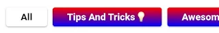
<li> <a href="#" class="active">All</a> </li> <li> <a href="#">Tips and tricks💡</a> </li> <li> <a href="3">awesome apps😯</a> </li> <li> <a href="#">WhatsApp trick 🤫</a> </li> <li> <a href="#">Instagram filter</a> </li> <li> <a href="#">Editing</a> </li> <li> <a href="#"> wa chat lock</a> </li> <li> <a href="https://t.me/photo_editing_groups"> telegram group</a> </li> <li> <a href="https://follow.it/dkk-technozone1">FOLLOW</a> </li> <li> <a href="https://www.instagram.com/dhanjeerider1">INSTAGRAM</a> </li> <li> <a href="https://youtube.com/dhanjeerider">subscribe</a> </li> </ul> </div>
Floating mobile menu V2
 |
| Bottom side of site with scroll hide |
   <nav class='mobile' id='ATnav'>

  <ul>
  <li> <a href='#'><svg style="color: blue" xmlns="http://www.w3.org/2000/svg" width="16" height="16" fill="currentColor" class="bi bi-house-door-fill" viewbox="0 0 16 16"> <path d="M6.5 14.5v-3.505c0-.245.25-.495.5-.495h2c.25 0 .5.25.5.5v3.5a.5.5 0 0 0 .5.5h4a.5.5 0 0 0 .5-.5v-7a.5.5 0 0 0-.146-.354L13 5.793V2.5a.5.5 0 0 0-.5-.5h-1a.5.5 0 0 0-.5.5v1.293L8.354 1.146a.5.5 0 0 0-.708 0l-6 6A.5.5 0 0 0 1.5 7.5v7a.5.5 0 0 0 .5.5h4a.5.5 0 0 0 .5-.5z" fill="blue"></path> </svg> <span>Home</span></a></li>

  <li><a href='#'><svg style="color: red" xmlns="http://www.w3.org/2000/svg" viewbox="0 0 256 256"><rect width="256" height="256" fill="none"></rect><path d="M219.9,140a92,92,0,0,1-184,0c0-23.1,9.9-49.7,29.4-79.1a8,8,0,0,1,5-3.4,8.2,8.2,0,0,1,6.1,1.2l32.2,21.5,30.9-64.8a7.9,7.9,0,0,1,5.8-4.4,8.1,8.1,0,0,1,7.1,2.2c14.7,14.7,31.5,32.6,44.6,53.4C212.4,91.1,219.9,115.1,219.9,140Z" fill="red"></path></svg><span>Trending</span></a> </li>

    <li><a href='https://youtube.com/dhanjeerider'><svg style="color: red" xmlns="http://www.w3.org/2000/svg" width="16" height="16" fill="currentColor" class="bi bi-youtube" viewbox="0 0 16 16"> <path d="M8.051 1.999h.089c.822.003 4.987.033 6.11.335a2.01 2.01 0 0 1 1.415 1.42c.101.38.172.883.22 1.402l.01.104.022.26.008.104c.065.914.073 1.77.074 1.957v.075c-.001.194-.01 1.108-.082 2.06l-.008.105-.009.104c-.05.572-.124 1.14-.235 1.558a2.007 2.007 0 0 1-1.415 1.42c-1.16.312-5.569.334-6.18.335h-.142c-.309 0-1.587-.006-2.927-.052l-.17-.006-.087-.004-.171-.007-.171-.007c-1.11-.049-2.167-.128-2.654-.26a2.007 2.007 0 0 1-1.415-1.419c-.111-.417-.185-.986-.235-1.558L.09 9.82l-.008-.104A31.4 31.4 0 0 1 0 7.68v-.123c.002-.215.01-.958.064-1.778l.007-.103.003-.052.008-.104.022-.26.01-.104c.048-.519.119-1.023.22-1.402a2.007 2.007 0 0 1 1.415-1.42c.487-.13 1.544-.21 2.654-.26l.17-.007.172-.006.086-.003.171-.007A99.788 99.788 0 0 1 7.858 2h.193zM6.4 5.209v4.818l4.157-2.408L6.4 5.209z" fill="red"></path> </svg> <span>YouTube</span></a></li>


    <li><a href='https://t.me/photo_editing_groups'><svg style="color: blue" xmlns="http://www.w3.org/2000/svg" width="16" height="16" fill="currentColor" class="bi bi-telegram" viewbox="0 0 16 16"> <path d="M16 8A8 8 0 1 1 0 8a8 8 0 0 1 16 0zM8.287 5.906c-.778.324-2.334.994-4.666 2.01-.378.15-.577.298-.595.442-.03.243.275.339.69.47l.175.055c.408.133.958.288 1.243.294.26.006.549-.1.868-.32 2.179-1.471 3.304-2.214 3.374-2.23.05-.012.12-.026.166.016.047.041.042.12.037.141-.03.129-1.227 1.241-1.846 1.817-.193.18-.33.307-.358.336a8.154 8.154 0 0 1-.188.186c-.38.366-.664.64.015 1.088.327.216.589.393.85.571.284.194.568.387.936.629.093.06.183.125.27.187.331.236.63.448.997.414.214-.02.435-.22.547-.82.265-1.417.786-4.486.906-5.751a1.426 1.426 0 0 0-.013-.315.337.337 0 0 0-.114-.217.526.526 0 0 0-.31-.093c-.3.005-.763.166-2.984 1.09z" fill="blue"></path> </svg>
<span>Group</span></a></li>


    <li><a href='#'><svg style="color: red" xmlns="http://www.w3.org/2000/svg" width="16" height="16" fill="currentColor" class="bi bi-arrow-up-circle-fill" viewbox="0 0 16 16"> <path d="M16 8A8 8 0 1 0 0 8a8 8 0 0 0 16 0zm-7.5 3.5a.5.5 0 0 1-1 0V5.707L5.354 7.854a.5.5 0 1 1-.708-.708l3-3a.5.5 0 0 1 .708 0l3 3a.5.5 0 0 1-.708.708L8.5 5.707V11.5z" fill="red"></path> </svg><span>Go to Top</span></a></li>

    </ul>

</nav>


<style> a{text-decoration: none;}
  nav.mobile { display: flex; position:fixed; right:20px; bottom: 20px; width: 90%; padding-right:0px; padding-left:0px; background: #ffffff81; border: 1px solid #000000c3; z-index: 9999; margin: 0;
  font-weight:bold;   border-radius: 40px;
box-shadow: rgba(50, 50, 93, 0.25) 0px 30px 60px -12px inset, rgba(0, 0, 0, 0.3) 0px 18px 36px -18px inset;}


  .mobile { transition: 0.5s ease!important; } nav.mobile ul { list-style: none; display: flex; justify-content: space-between; align-items: center; width: 100%; margin: 0; justify-self: center; vertical-align: middle; } nav.mobile ul li { display: flex; flex-direction: column; align-items: center; font-size: 0.7rem; flex-grow: 1; margin: 7px 0; } nav.mobile ul li a { color: #222; font-size: inherit; display: var(--prP3M8); flex-direction: var(--mZSq9k); }nav.mobile ul li a svg{width: 24px; height: 24px; display: block;margin: 0 auto;} </style>


<script>
//<![CDATA[
var prevScrollpos = window.pageYOffset;
window.onscroll = function() {
var currentScrollPos = window.pageYOffset;
  if (prevScrollpos > currentScrollPos) {
    document.getElementById("ATnav").style.bottom = "0";
  } else {
    document.getElementById("ATnav").style.bottom = "-80px";
  }
  prevScrollpos = currentScrollPos;
}
//]]>
</script>
Slide menu code V2
 |
| Slide menu html css |
      <div class="scrollable-tabs-container">
        <!-- NOTE: CHANGE THE LINK AND TEXT FOR PINK BUTTOS Like (Tips 💡) visible on your site 👇👇-->

   <ul>
 <li> <a href="3"><i class="fa-solid fa-globe"></i> Website design</a> </li>
 <li> <a href="#"> <i class="fa-duotone fa-crown"></i> Canva pro</a> </li> <li> <a href="#"><i class="fa-duotone fa-files"></i> filter file</a> </li>  <li> <a href="https://t.me/photo_editing_groups"> <i class="fa-brands fa-telegram"></i> telegram group</a> </li> <li>
 <a href="#"><i class="fa-solid fa-tools"></i> tools</a> </li>
<li>
 <a href="#"><i class="fa-brands fa-google-play"></i> OSM APPS</a> </li> <li> <a href="https://www.instagram.com/dhanjeerider1"><i class="fa-brands fa-instagram"></i> IG</a> </li> <li> <a href="https://youtube.com/dhanjeerider"><i class="fa-brands fa-youtube"></i> YT</a> </li> </ul>  </div>

<style>

.scrollable-tabs-container { font-family: "Alata", sans-serif; background: transparent; width: 375px;  margin: -9px -20px; border-radius: 4px; overflow: hidden; position: relative;}
  .scrollable-tabs-container ul { display: flex; gap: 9px; padding: 9px 24px; margin: 0; list-style: none; overflow-x: scroll; -ms-overflow-style: none; scrollbar-width: none; scroll-behavior: smooth; } .scrollable-tabs-container ul.dragging a { pointer-events: none; } .scrollable-tabs-container ul.dragging { scroll-behavior: auto; } .scrollable-tabs-container ul::-webkit-scrollbar { display: none; } .scrollable-tabs-container a { color: #fff; text-decoration: none; font-weight: bold;
  padding: 7px 15px; display: inline-block; border-radius: 50px; user-select: none; white-space: nowrap; text-transform: uppercase;
box-shadow: rgba(0, 0, 0, 0.4) 0px 2px 4px, rgba(0, 0, 0, 0.3) 0px 7px 13px -3px, rgba(0, 0, 0, 0.2) 0px -3px 0px inset;
background-image: linear-gradient(144deg,#AF40FF, #5B42F3 50%,#00DDEB);}

 .scrollable-tabs-container li a:hover{
box-shadow: none;
border: .6px solid black;
background-image: linear-gradient(380deg,#AF40FF, #5B42F3 50%,#00DDEB);}


</style>
My website thin menu code
 |
| Youtube type custom menu |
  <div class="scrollable-tabs-container">
   <ul>
<li> <a href="#"><i class="fa-solid fa-globe"></i> Website design</a> </li>
 <li> <a href="#"> <i class="fa-solid fa-crown"></i> Canva pro</a> </li> <li> <a href="https://www.dkone.in/search/label/Instagram%20tips%20%E2%9A%A1?max-results=10"><i class="fa-solid fa-file"></i> filter file</a> </li>  <li> <a href="https://telegram.me/photo_editing_groups"> <i class="fa-brands fa-telegram"></i> telegram group</a> </li>
<li> <a href="#"> <i class="fa-solid fa-code"></i> Codes For Blogger</a> </li>
<li> <a href="#"><i class="fa-solid fa-tools"></i> tools</a></li>
<li> <a href="#"> <i class="fa-solid fa-cart-plus"></i> Themes</a> </li>
<li>
 <a href="#"><i class="fa-brands fa-google-play"></i> OSM APPS</a> </li> <li> <a href="https://www.instagram.com/dhanjeerider1"><i class="fa-brands fa-instagram"></i> Instagram</a> </li> <li> <a href="https://youtube.com/dhanjeerider"><i class="fa-brands fa-youtube"></i> YouTube</a> </li> </ul>
 </div>
<style>

.scrollable-tabs-container {  background: transperant; width: 375px; margin: -10px -20px; border-radius: 4px; overflow: hidden; position: relative;}
  .scrollable-tabs-container ul { display: flex; gap: 9px; padding: 9px 24px; margin: 0; list-style: none; overflow-x: scroll; -ms-overflow-style: none; scrollbar-width: none; scroll-behavior: smooth; } .scrollable-tabs-container ul.dragging a { pointer-events: none; } .scrollable-tabs-container ul.dragging { scroll-behavior: auto; } .scrollable-tabs-container ul::-webkit-scrollbar { display: none; }

.scrollable-tabs-container a { color: var(--jt-heading-link); text-decoration: none;  text-transform: capitalize;
 padding: 4px 8px; display: inline-block; border-radius: 20px; user-select: none; white-space: nowrap;
  font-weight: 500;
Border: .8px solid var(--jt-heading-link);

font-size: 14px;
}

.scrollable-tabs-container a:hover{

box-shadow: rgb(204, 219, 232) 3px 3px 6px 0px inset, rgba(255, 255, 255, 0.5) -3px -3px 6px 1px inset;
}
.scrollable-tabs-container a:active{
    background: #8eaef3;
}
@media screen and (min-width: 485px) {
  .scrollable-tabs-container{
   Width: 100%;
Margin: 0; } }
</style>
You can see demo of all menu design on this link click here
slide-in menu
The slide-in menu is another popular style of mobile menu that slides in from the side of the screen. This style of menu is similar to the hamburger menu, but it offers more space for the menu items, making it easier for the user to navigate the menu. The slide-in menu can be customized with different colors and fonts to match the style of your website.Tabbed menutabbed menu
The tabbed menu is a unique style of mobile menu that is characterized by tabs that are stacked on top of each other. When the user clicks on a tab, the menu items slide out from underneath the tab. This style of menu is perfect for websites with a limited number of menu items, as it allows the user to quickly switch between different sections of the menu.Floating menufloating menu
The floating menu is a modern and stylish style of mobile menu that floats on top of the content of the website. This style of menu is perfect for websites with a minimalist design, as it does not take up much space on the screen. The floating menu can be customized with different colors and fonts to match the style of your website.Conclusion
Creating a custom-coded mobile menu for your blogger website can help improve the user experience of your website and make it easier for users to navigate your site. By using one of the four styles of mobile menus we have provided, you can create a beautiful and functional mobile menu that will enhance your website BeautyThanks for reading 😊
Iff you are liked this read other post and never forget to search DK technozone on Google for latest updates 😎
Last word
In this post we will provided information about Top 5 coded menu for blogger HTML css, If you enjoy this post, kindly share it with your friends. For any queries, feel free to join our Telegram channel, where we share exclusive and informative content. Many valuable tips are exclusively available on our Telegram channel. Stay updated with your favorite source, DK Technozone.

Dhanjee Rider
Dk Technozone An Editor,Programmer, grafix Designer Website Designer,Android Geek, Instagram Filter Seller, Blogger, Seo Expert, Wordpress Geek etc. Telegram


![PUBG Mobile Lite config Ultra Aimbot auto headshot: Latest Update [100% Working]](https://blogger.googleusercontent.com/img/b/R29vZ2xl/AVvXsEhBIxYwXISNcJn0UpDTG0Rg__RYya6j6wgoAfI1V5DMcd9E1uPzYjiJwpvkrjbMa41dpv1zh3VN0bmZ63yisgSuGroWDaIcPS5SbS0iJlworQsR7yEdaZWeOrfrryqf2vo1twZwUp9NE5LYGeCuYs1rPDMW3jGnHbrfd6jKAvmq31sOvK1eT2-Db_S1VrY/s16000/1000113727.webp)


![VegaMovies WordPress Theme v2.0 [ Soft-look]](https://blogger.googleusercontent.com/img/b/R29vZ2xl/AVvXsEgtj4DsFU7AIynwctVX26kWsggi6nylYDadyhV8PoTOyWUU_kQvMriZpwWoEW1_9knbepEjhihxk9UhbO7U-3vTeHv2XIbsMzLx9TXF9f1AoxbTuUehPajFqWeOzaHsJuPJussdjuRyGNSqmMDNQREqahKEjcrtvvGAFxiNh3ky9sjUCRYY0zm8lK9gJcw/s16000/1000098739.png)